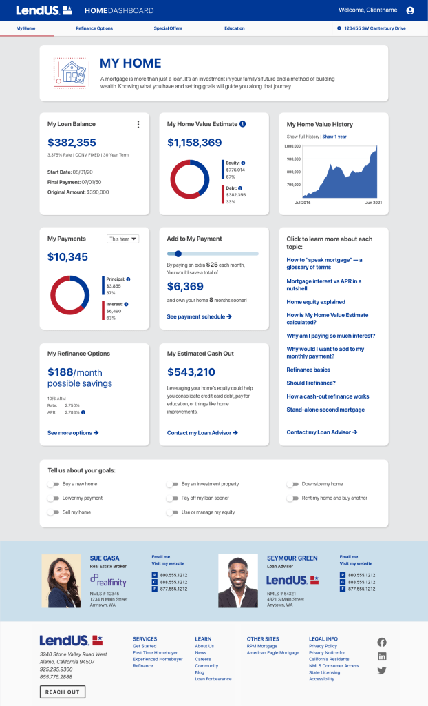
LendUS software developers had created this platform, intending to replace several costly software services provided to loan advisors and their teams. After it was started, I was brought in to create a better user experience and user interface design. This project included all the platform UX writing and design, and re-writing and re-designing the triggered emails to clients and agents. I conducted user testing at several stages with end users and loan advisors, which led to changes that made the site easier to use and understand.
My mockup was made from scratch in Adobe XD and you can see the whole prototype here. (Not all links work because no changes were needed from the devs on that particular item!) Because LendUS was the parent company for 3 other brands, I also made mockups for the 3 other brands and for Realfinity, the spin-off company that owns HomeDashboard.
Initially I made mobile prototypes, but I found that the devs were able to translate the desktop layouts and functionality without the need for mockups from me.

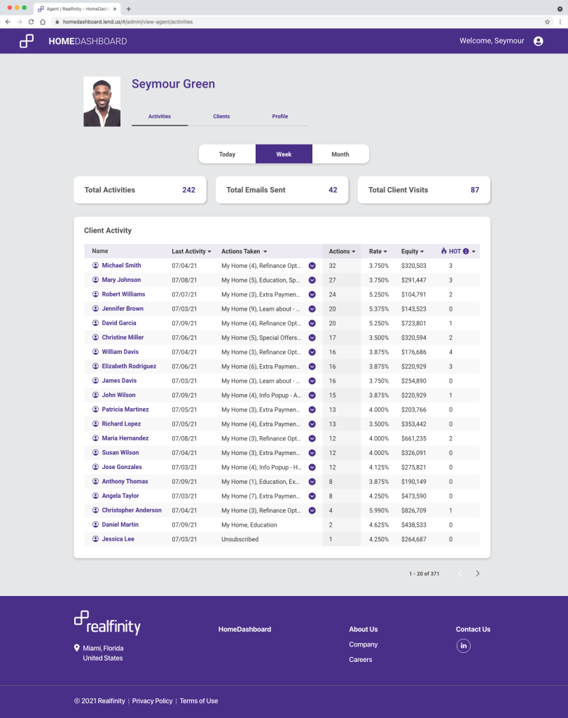
I also re-designed the agent-facing interface of HomeDashboard. This provided a cleaner summary for loan advisors to see what actions their clients had taken on their HomeDashboard account. Here is a prototype I made to show the devs how to add modals to show the activity detail and an explainer of the “hot” activities concept. (Since this was made just to demonstrate these two features, only the top two rows work correctly.)
After these prototypes were made, LendUS merged with a larger mortgage company, and the HomeDashboard product became the basis for the spinoff SaaS startup, Realfinity.
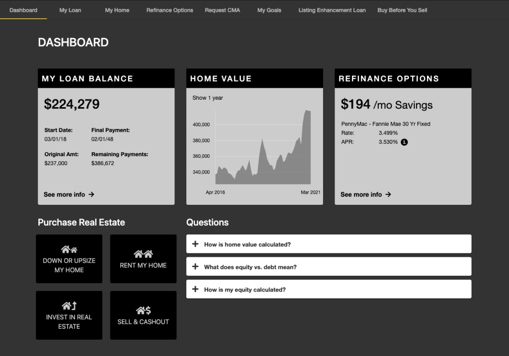
If you’re curious about what I started from, below is a screenshot of the version of HomeDashboard that the software developers made (in a skin for a subsidiary of LendUS):
