The Lightspeed Trade Up program helps loyal customers save when they upgrade to the newest technology (and helps the company with market share). In my seven years at the company, this was the most debated, most iterated page on the site.
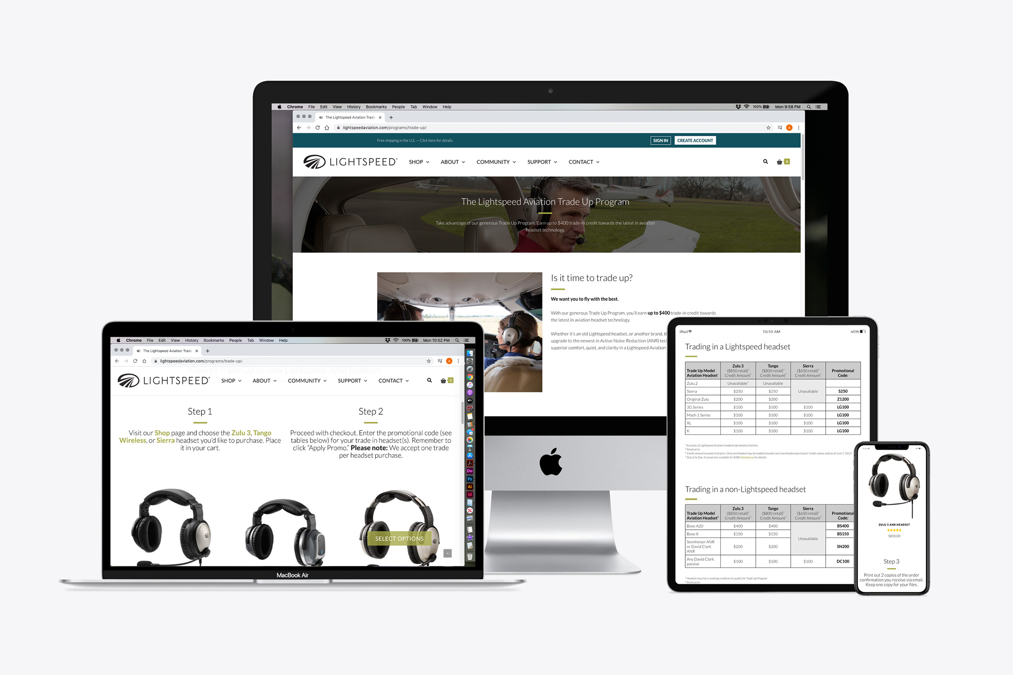
Until about 2014, pilots preferred to call in to arrange their trade, but they could use a coupon code at checkout online. (By 2014, iPads could be used instead of paper charts in flight, there was an app for everything in general aviation, and online direct sales were picking up.) Calls were still coming in because the instructions for doing the trade and getting the discount were unclear. In response, we added an an intro page with detailed instructions, and users then could click to see the credit values tables. This cut down on phone calls.
Sitting next to the customer service department provided constant customer insights for improving the user experience of the Trade Up program landing page (as well as the rest of the site). There was still one big UX hangup: Customers had to find their discount code on one of three tables, put the new headset in their cart, and type in their discount code at checkout. Not everyone knows the model name of their old headset, so they put in the wrong codes. Or they read the table wrong. Or they put in the code with the biggest discount, sent in something else, and a phone call is required to collect payment for the difference, which caused delays.
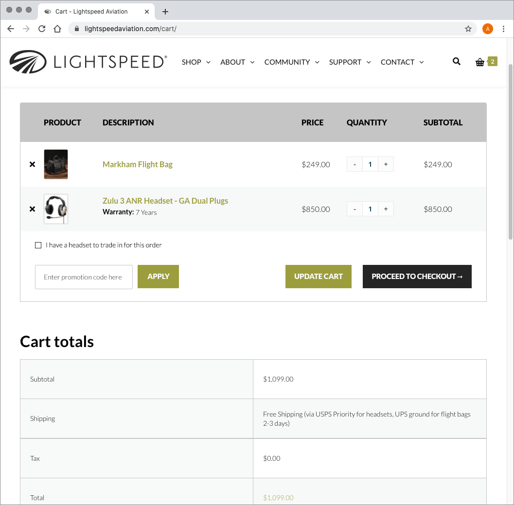 I proposed getting rid of the discount codes for trades. [Click here to see an animated mockup of my proposed user experience solution.] First, I would add a checkbox on the shopping cart page that was by default unchecked, but the text beside it would say “I have a headset to trade in for this order.” Then if the user checked the box, a drop-down would appear below it to prompt the user to choose if they were trading in a Lightspeed headset or a competitor’s, then pick the headset they were trading in (with a list of all eligible headsets). When that choice is selected, another drop-down appears, and the user selects the new headset in their order for which they wished to apply the credit. Each prompt could roll out using logic from the selection before — no more discount codes, no more errors, delays, or taking up A/P time issuing credits.
By the time I left Lightspeed, an existing WordPress/Woocommerce plug-in hadn’t been identified that could handle that kind of interaction with the number of codes needed.
